Thursday 16 December 2010

Photoshop: Yearbook photos

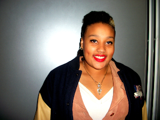
Original Photo:

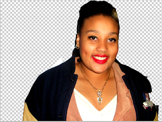
Step 1: Using the Magnetic Lasso Tool I selected Karshena so that I could enlarge only her within the image


Step 2: I then placed Karshena back on her original photo

Step 3: I then used the black and white button to change the colour of the photo.
Step 4: I used the Gradient tool to give the photo a washed out look as I want the pictures in the Yearbook to look dated.
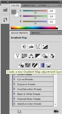
Step 5: I changed the opacity of the Gradient so the photo only looks slightly washed out.
I did the same for the two other 'yearbook' photos on side 3 of the digipak.


Wednesday 15 December 2010

Back of Digipak


I decided to design the back of the digipak as if it was the back of the front cover, this is why I have blank polaroids. After looking at various albums and singles and also the work of the last A2 students, I discovered that most do not feature pictures of the band. I also found out the sort of information that the back of the digipak needs such as the music company name, a barcode and various legal information.

draft 2 for side 3

After receiving feedback for my digipak drafts, I found out that I couldn't use 'found' images. I removed the right side of the 'yearbook' and replaced it with my larger original photos. I decided to carry on the high school theme for this part of the digipak and have created a yearbook with the lead singer and the love interest from the video as the Prom King and Queen. I used the photographs that I took to show the transformations for the digipak yearbook photos. After looking at old American yearbooks online I copied the style of the photographs by making them black and white and slightly lowered the gradient for a washed out look.

Monday 6 December 2010

CD Section

2nd Draft Front Cover


After finding out that the Polaroid Camera was first sold in 1948 and gained popularity in the '50's, I decided to use the various images I took and create them into 'Polaroid shots'. I decided to carry on the prom theme from the video onto the digipak, this is why I decided to have a shot of the whole 'class' rather than just the band (the band feature on where the cd will go). I also used the same font and colours as the ones we used for the posters we made for the video to create the idea of 'team spirit' and an American High School.

Final Cut for Video

Friday 3 December 2010

First Draft Front Cover


First Draft for the front cover of my digipak

03/12/10

After uploading the video today, I had to delete it due to the quality of which it uploaded. Also, the video had a clip at the end that shouldn't have made the final cut.
On Monday I will upload the correct video and finish the first draft for my digipak.