A2 Media: Music Videos
Tuesday, 8 February 2011
Monday, 7 February 2011
07/02/2011
I'm currently having problems uploading my evaluation to Youtube/Blogger which I hope to resolve as soon as possible.
Monday, 31 January 2011
Friday, 7 January 2011
Magazine Advert

I added in critics 'reviews' of the single to fill in the gap on the draft advert and also to follow the conventions of a magazine advert for a single. I repositioned the artist and single name as I felt it looked better in the new position and also was clearer on the advert. I kept the main image the same as I looked at various magazine adverts and the only image is the single/album cover.
First Draft Magazine Advert

After looking at various magazine adverts for albums, I found out the certain elements that need to be on a single advert such as the date of the release and the record company. Just like the other adverts, I used the single cover as the main and only image as the people reading the magazine would need to be able to recognise the single so that they could purchase it with ease. I used the same font and colours from the digipak again so the public would be able to find it quickly.
Saturday, 1 January 2011
Draft for digipak
 I attempted to carry the American High School theme throughout the digipak, I did this by using the 'polaroid' images (the Polaroid camera was invented in 1948 and gained popularity in the '50's) and using a 'Yearbook' to display my other images. I carried a colour theme throughout the digipak of Purple, Yellow and White, this is because the posters we made for the music video consisted of these colours, the imaginary school took on these colours as their own.
Thursday, 16 December 2010
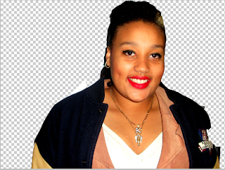
Photoshop: Yearbook photos
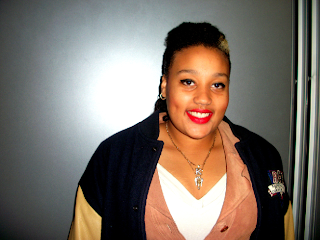
Original Photo:


Step 2: I then placed Karshena back on her original photo

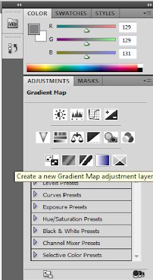
Step 3: I then used the black and white button to change the colour of the photo.


Step 4: I used the Gradient tool to give the photo a washed out look as I want the pictures in the Yearbook to look dated.


Step 5: I changed the opacity of the Gradient so the photo only looks slightly washed out.

I did the same for the two other 'yearbook' photos on side 3 of the digipak.
Subscribe to:
Comments (Atom)