Thursday 16 December 2010

Photoshop: Yearbook photos

Original Photo:

Step 1: Using the Magnetic Lasso Tool I selected Karshena so that I could enlarge only her within the image


Step 2: I then placed Karshena back on her original photo

Step 3: I then used the black and white button to change the colour of the photo.
Step 4: I used the Gradient tool to give the photo a washed out look as I want the pictures in the Yearbook to look dated.
Step 5: I changed the opacity of the Gradient so the photo only looks slightly washed out.
I did the same for the two other 'yearbook' photos on side 3 of the digipak.


Wednesday 15 December 2010

Back of Digipak


I decided to design the back of the digipak as if it was the back of the front cover, this is why I have blank polaroids. After looking at various albums and singles and also the work of the last A2 students, I discovered that most do not feature pictures of the band. I also found out the sort of information that the back of the digipak needs such as the music company name, a barcode and various legal information.

draft 2 for side 3

After receiving feedback for my digipak drafts, I found out that I couldn't use 'found' images. I removed the right side of the 'yearbook' and replaced it with my larger original photos. I decided to carry on the high school theme for this part of the digipak and have created a yearbook with the lead singer and the love interest from the video as the Prom King and Queen. I used the photographs that I took to show the transformations for the digipak yearbook photos. After looking at old American yearbooks online I copied the style of the photographs by making them black and white and slightly lowered the gradient for a washed out look.

Monday 6 December 2010

CD Section

2nd Draft Front Cover


After finding out that the Polaroid Camera was first sold in 1948 and gained popularity in the '50's, I decided to use the various images I took and create them into 'Polaroid shots'. I decided to carry on the prom theme from the video onto the digipak, this is why I decided to have a shot of the whole 'class' rather than just the band (the band feature on where the cd will go). I also used the same font and colours as the ones we used for the posters we made for the video to create the idea of 'team spirit' and an American High School.

Final Cut for Video

Friday 3 December 2010

First Draft Front Cover


First Draft for the front cover of my digipak

03/12/10

After uploading the video today, I had to delete it due to the quality of which it uploaded. Also, the video had a clip at the end that shouldn't have made the final cut.
On Monday I will upload the correct video and finish the first draft for my digipak.

Thursday 25 November 2010

Survey Results Analysis

Generally the results from the survey for our draft video were positive, however we received some interesting criticism that we are going to act upon.
60% of people felt that there was enough close up shots of our lead singer, after watching the video it is clear that we need add more shots as this would be expected by any record company. 80% of people felt that the relationship between the leads was believable, we feel that we need to add more shots of the lead girl to cement how the belief. This was also reiterated in the additional comments box.
86% of the audience felt that the video fitted with the genre and everybody felt that the music and visuals were well linked, this is important as the video has to be clear to the modern audience. However, only 66% of the audience felt the narrative was clear in the video, me and Kizzy plan to correct this by removing any confusing elements and adding more close up shots of the leads. We also need to add more close up shots of the leads and band shots according to the survey.
In the final comments section, the feedback was generally positive. The main problem people had was that at parts the video went out of sync, this is easily corrected though. Everybody felt that the mis en scene was on point and this is important as it would be too difficult to correct at such a late stage.

Survey Results


Monday 15 November 2010

Teacher Feedback

Hi Lauren,

You have completed all set tasks as well as some further tasks that really make your blog interesting. Your time management is excellent, research into existing products is thorough and a lot of work has gone into the planning stage. You are also starting to collate information and feedback from your audience – when you collate this you will boost your grade further. Also, make sure that your entries are in the correct order – the pitch should be the first part of the planning. In addition your daily blog entries should be posted on the day – you shouldn’t have two or three days on one post.

L4 – 16/20

Friday 12 November 2010

Link to Survey

http://www.surveymonkey.com/s/FB2Z5NV

12/11/10

As only 10 people have filled in the surveys we are going to wait for more feedback before analysing the results. As it stands the feedback is generally positive but some interesting points are made and will definitely help us with the final cut.
This lesson, me and Kizzy continued to edit the final cut of our video.

Thursday 11 November 2010

11/11/10

Today me and Kizzy made a survey on Survey Monkey for the first draft of the video so that we can gather feedback. This is vital for us when we are editing the final cut, we have to meet the audiences expectations.

Monday 8 November 2010

08/11/2010

After receiving feedback from Ms McLeod, me and Kizzy started to remove any 'bad' footage from our first draft and start to edit it to a higher level. For the next few weeks this is what we intend to do so that our video is of a high quality.

1950's

After the destruction and horrors of WWII, a new age of post modernism was enjoyed by the western world as everything was under scrutiny. Rock n Roll emerged as the music of choice of teens that now have more time on their hands.
The US was in conflict during the period in the famous Communism vs. Capitalism Cold Wars. The Red Scare in the US and the Space Race encouraged Americans to enjoy their capitalistic lifestyle and sneer at communists. The people were highly materialistic and socially conservative, just like the people of the 1920’s, it seemed history was doing a full circle.
Rock n Roll achieved dominance due to the Civil Rights Movement, teens could relate with the other race as icons such as Presley and Cooke combined both Blues and Country music. Teens would allow this music to dictate their lifestyle as their fashion, vehicles, films and even language was inspired by the genre.
TV was increasing in popularity, this allowed Presley, Buddy Holly, James Brown and others to increase their popularity and allowed ‘stars’ to be born. Film is also said to have gone through a ‘renaissance’ after the war with Hollywood’s legends being a part of everyone’s everyday life. Monroe, Brando, Taylor and Dean all experienced dominance in their field during this era.
The 1950’s was an age of new beginnings after WWII destroyed the old society; however, although there were new things, most of the media remained conservative. That’s if we overlook Hefner’s Playboy magazine which was released in 1953.


The Baseballs/Crazy In Love


Crazy In Love by Beyonce achieved number 1 in both the UK and the US and was top ten worldwide. The song is iconice and Beyonce experienced critical acclaim and won two Grammys for the song. Jake Nava produced the iconic video and also produced Usher's 'Burn', Britney Spears' 'If U Seek Amy' and Beyonce's 'Single Ladies', with both Beyonce videos being famous for the dance sequences. Crazy In Love was voted number 3 in Rolling Stones best songs of the decade and still enjoys regular airplay now.


The Baseballs are an all male trio from Berlin who met in a hard rock cafe and started talking due to their mutual fashion. They found popularity with their 1950's take on 'Umbrella and 'Hot 'n' Cold' and feel they lead modern songs to their 'true calling'. After attending a Baseballds gig it was clear they had a diverse audience, not only older people enjoying the nostalgia of a forgotten era but also young people enjoying an alternative take on modern hits.
The Baseballs seek to promote not only 50's music but also a 50's lifestyle and are famouse for their three way Elvis hipshake.

Kid Cudi Magazine Ad


The name of the artist in the magazine advert is Kid Cudi which derives from the stars surname ‘Mescudi’. His mix tape ‘A kid named Cudi’ where he found his first taste of fame lent inspiration to the name. As he is a rapper, Cudi has to have a stage name like his counterparts; ‘Scott Mescudi’ wouldn’t sell. A stage name also allows artists to take on a new persona whilst they perform.


The font on the advert is best described as standard; it also looks like an American College Alumni type font. This suggests that Cudi feels that his latest album is in the higher leagues of hierarchy. Also the ‘A’s’ are missing the middle line, which makes them look like triangles, this would please the trendy ‘hipster’ fans. ‘Kid Cudi’ is wrote in the stars branded font and is instantly recognisable to his fans, the use of the little ‘I’s’ is the brand we all know. The lettering is done in white which offers a contrast against the almost black background, the advertisers ensure that we consumer the vital information. The simplistic styling of the ad presents Cudi as a stylish artist.


This stylish theme continues with Cudi’s attire, the suit and tie demonstrate the success of his first album as he can afford this expensive suit. Cudi has his head down in the picture which suggests a sense of humbleness; Cudi is saying that although he is big he is still ‘down to earth’. The theme of fame and success is reminiscent in the track listing, the album is split up into five acts, just like a Shakespeare play. Cudi is offering us a journey as the album is presented as a mass production and we are the audience.
The most dominant aspect of the ad is the writing; this is because this is the most important part. We need to get the information about the release date and the name of the album so we the audience, can go and purchase it. Just like the positioning of Cudi on the ad, the image is a side thought and as Cudi is a global star; all we need is his name to know who he is.
The name of the album is ‘Man on the Moon II: The Legend of Mr Rager’, this is a continuation of the story of Cudi’s first album Man on the Moon: The End of Da. Just as the title suggests, this album has a darker theme than the last with it even exploring Cudi’s former cocaine addiction. As Cudi is sitting in front of the galaxy, there is a suggestion that he has moved on to bigger things as he now has the universe behind him. This image compared to the 1st album, where Cudi’s face is merged with the moon suggest Cudi is now on a higher level.


This album was produced by Kid Cudi, which appeals to the audience as they feel they’re getting the true sound of the artist as he was part of each creative process. The other producers include Emile, Plain Pat, and Dot da Genius who was behind ‘Day ‘n’ Nite’, Cudi’s biggest mainstream release. The four record label logos feature on the advert near the bottom corner. Universal Motown, which is party of Universal is a contemporary incarnation of the infamous Motown Record label, GOOD Music was founded by Kanye West and features stars of alternative hip hop. Island Records consists of legendary artists such as Bob Marley and Amy Winehouse and Dream On is Cudi’s own record label. All these labels suggest that Cudi will be a megastar as big companies are involved; it also means the best people will work on the album.


Kid Cudi fits into his alternative hip hop genre as the advert suggests. His name fulfils his hip hop credentials and the image fulfils the alternative part. Cudi is presented as stylish rather than thuggish; this is atypical of other rappers. The stars on the cover as also associated with more indie artists such as the Friendly Fires. Cudi’s album fits into his genre and target audience as he is the ‘stoned and alone rapper’ whose music is ‘as consuming and intoxicating as the lifestyle Cudi describes’ (Greg Kot, Chicago Tribune). Kid Cudi’s target audience, who are older teens and young adults would firmly agree with this ethic.

Friday 5 November 2010

05/11/2010

Me and Kizzy decided that using Final Cut would be unnecessarily time consuming so have opted to use iMovie instead. We will edit some footage on Final Cut as it has better effects and then add this into iMovie.
I bought a copy of NME to use an artist album advert for my analysis and started to do write the analysis today.

Thursday 4 November 2010

04/11/2010

In today's Media lesson, me and Kizzy finished editing the first of draft of our music video on iMovie. It's not the best it can be but it's just a draft so we intend on watching the footage fully to ensure we put the best parts in the final video.

Permission Email


Email from Kizzy and I to the Record Label.

First Draft for video

Tuesday 26 October 2010

Fiest Digipak

The name of the artist on the digipak is Fiest, this connotes an indie type nature as this is a made up word, already she is not conforming. Fiest also sounds like ‘feisty’; the choice of this name could be a suggestion of the singer’s personality and nature.

The font on the front cover is best described as standard and simple. The lettering is neat and dominant against the white background as they have chose to have black lettering. This continues the black and white theme of the digipak as the images are mostly black and white and the backgrounds are white throughout the digipak. The physical appearance of Fiest on the front cover is highly ambiguous. She appears to be topless but it is hard to tell due to the heavy shadowing, Fiest seems to be doing this to continue the simplistic theme rather than being sexual. Due to her side on pose, the audience doesn’t get to see her full profile, this could be to suggest that there is more to Fiest than this album can imply. The close up shot allows us to take in as much of her as the image allows, Fiest is being ambiguous and challenging us to interpret the image.

Fiest is the dominant image throughout the whole digipak; she is the unique selling point as she is a solo artist. By combining a selection of unique images, Fiest is appealing to her target audience as she appears to be interesting. She also has to be dominant as she was propelled to fame by an iPod advert; she has to be recognisable to the buying public. The upside down image of Fiest suggests that she is more complicated than the front cover image suggests. The record company would have added this image like this due to her indie genre which is all about doing things in a new and different way. The other dominant image is of string, this features on the front cover image and then twice in the digipak. This could be to suggest that everything is somehow connected; however there can be various interpretations, Fiest probably wanted it this way too.

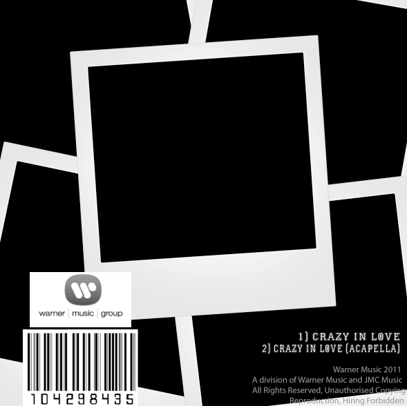
The title of the album is The Reminder; this is because Fiest offers nostalgic music due to her heavy 70’s influence. Fiest is reminding her audience of how music used to be. This is reinforced by the heavy use of sepia and also the Polaroid type shots; Fiest transports us with this digipak. The 70’s feel is continued due to the dominant colours, the black and white images and the sepia tones give the digipak a vintage feel. However, the pieces of string, which are also dominant, are primary colours; this could be to suggest a modern take on the past.

Fiest’s album was produced by many people including, Gonzales, Ben Mink, Renaud Letang and herself. All of the producers are Canadian like Fiest; this would appeal to the audience as it seems the album is heavily influence by her native country. Gonzales is also a recognisable artist as he found fame from an advert just like Fiest. The album won’t have an ‘LA finish’, this is good news for her indie fans.

Fiest’s record label is Cherry Tree, a major label focused on new talent. Their parent companies are Interscope and Polydor for the US and UK respectively. Fiest has the potential to be distributed on a mass scale if the record company chose to. She is also part of Arts and Crafts, an independent Canadian label. Again Fiest has remained true to her roots and seems to be heavily influence by Canada.

Fiest fits into her indie genre due to her artistic take on the digipak. The Polaroids, sepia and black and white images are major favourites of her indie fans. Her target audience would be indie 20-30’s year olds due to the heavy 70’s influence and nostalgia that she offers.

Tuesday 19 October 2010

Emails


Planning with Kizzy

  • Kizzy and I met with Mr Hitchenson to discuss using the instruments for October 16th
  • Kizzy spoke to Mr Lee about using the school on the Saturday
  • After dicussing the situation with Mr Lee and Mr Nugent, we discovered that using the school on the Saturday may be a problem, however after a series of emails we found that we could use the School's Drama Pod rather than the Theatre as previously planned.
  • Kizzy and I send a message to the members of the Facebook Music Video Event to confirm or deny their place so we can estimate the number of people.
  • We went to Watney Market on Friday 15th to buy props from a card shop, after buying streamers and party poppers, we then went to Sainsburys to buy balloons.
  • After school on the Friday, me, Kizzy and Tu-Ann stayed after school to make banners and confetti for the video.
  • Later that evening, I collected some 1950's clothing from my Media teacher.
  • Saturday 16th, everyone met at school at 1:45 to set up the Drama Pod. This included collecting and setting up the instruments and microphones, blowing up the balloons and decorating the Pod to look as 1950's as possible.
  • Our actors arrived at 2:30 and started to having their hair/make up done.
  • Filming started at 4:30 and continued through to 6:00
  • After filming we put away our props and tidied the Pod.